Print, Design & Websites

Posted: April 10, 2019 • Posted in: Graphic Design, Printing
Pantone®/CMYK/RGB – What’s the difference?
In branding, colour is everything. It can make a company’s logo instantly recognisable, and increase brand recognition significantly. Indeed, studies show that colour can increase brand recognition by up to 80% (Source: University of Loyola, Maryland study).
With this in mind, it’s interesting to see that some businesses don’t have full consistency across their brand. Business cards don’t quite match letterheads, or brochures are printed in a slightly different shade to the vehicle livery. How can brands improve on this, and achieve consistency across all their marketing channels?
This blog looks at the difference between Pantone, CMYK and RGB, and the effect it has on the final printed output…
What are RGB, CMYK, and Pantone®?
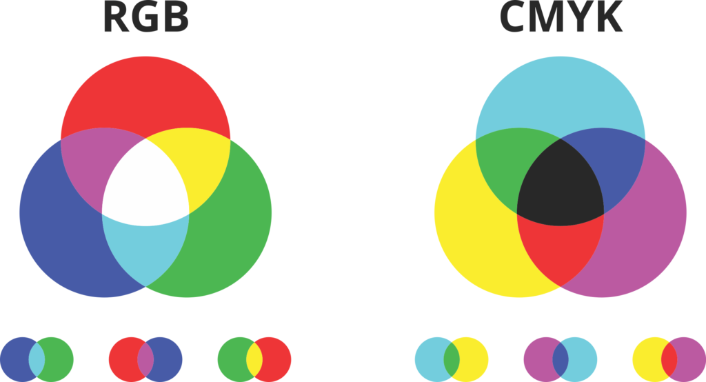
RGB, CMYK and Pantone are colour models used to create a full range of colours using basic primary colours. There are two types of colour model – additive and subtractive.
Additive models use combinations of light added to a black screen to create colours. Subtractive models use inks to reduce the amount of light that is reflected from a white page, creating the colours interpreted by the human eye.
What is RGB?
RGB is an additive colour model used in digital displays such as TVs, mobile phone screens and computer monitors. RGB stands for the colours Red, Green and Blue. Combinations of light in these colours are combined to create the different shades we see on screen.
There are 216 web safe colours that can be created using the RGB model, and these are all assigned a hexadecimal value. These colours can be displayed on all computer displays.
A purely digital format RGB is never used in printing.
For the printing process, colours are converted into a CMYK format
What is CMYK?
CMYK stands for Cyan, Magenta, Yellow and Key. Or light blue, purplish-red, yellow and black. There are a few theories as to why black is known as ‘key’. It’s suggested that K is used instead of B to simply avoid confusion with the colour blue.
The more widely accepted theory is that as the other plates are aligned (or keyed) with the key of the black plate, then the black colour is given the initial K. Although the three primary colours mixed together create a black effect, it is not fully saturated, hence the need for a separate black plate.
By mixing these four colours, new colours can be created. Printed as a selection of tiny dots layered over one another, the human eye interprets a solid colour. Shades are achieved by widening the space between the dots, allowing different amounts of the white paper to show through.
Most colours can be created using the CMYK system, however bright, fluorescent and metallic colours require a different colour matching system – Pantone.

The main difference between RGB and CMYK
Unlike a computer screen, which starts black a blank piece of paper is white. Therefore, the process of creating colour is different. With RGB, light is added at different levels to create colours. Maximum levels of red, green and blue will create white light. CMYK printing adds ink to reduce or soak up the light that is reflected into our eyes from the white paper. Adding 100% levels of cyan, magenta and yellow will create black.
With this in mind, it’s clear to see that RGB colours will appear totally different on a screen than they will when printed on paper.
But just to confuse things even more, as many settings (such as brightness and contrast) can be customised on a monitor’s display, colours will display differently, not only from computer to paper but also from computer to computer. Something else to bear in mind!
What is Pantone® (PMS)?
Named after the corporation that created it, Pantone is a system for matching colours, known as the Pantone Matching System or PMS.
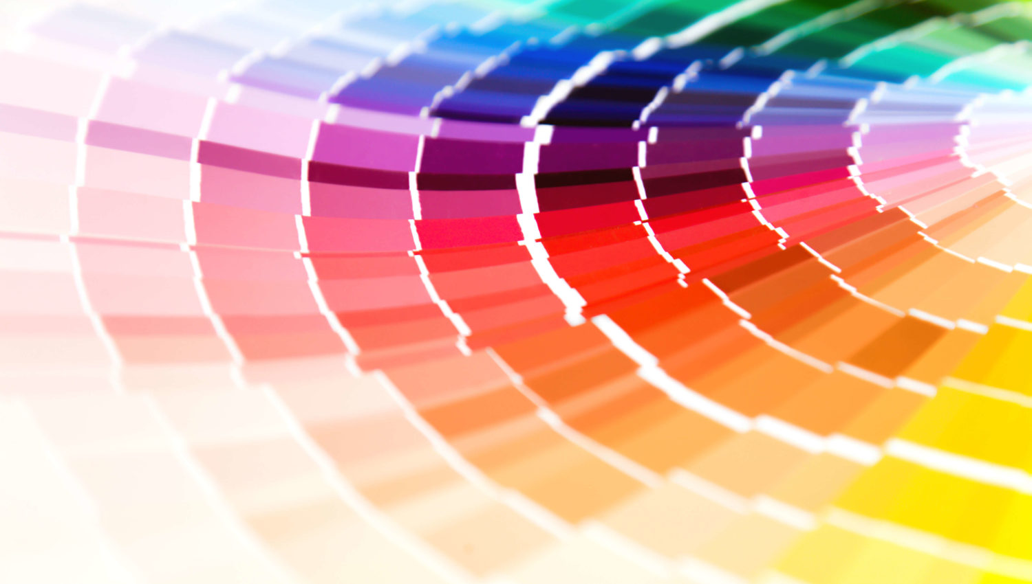
As it’s pre-mixed before the ink is applied to the substrate, Pantone creates the most consistent colour possible. Instead of layering dots over each other, Pantone produces a block of pure colour.
Pantone colours can be trademarked, protecting a business’s brand identity. For example, Pantone 2685C is the purple used by Cadbury in their Dairy Milk bars. Pantone 021C is easyJet orange.
What colour scheme should I provide for my branding?
- RGB colours are to be used for digital displays only i.e. websites, video
- CMYK is used in most everyday printing and for reproducing photographs.
- PMS provides the most accurate colour match, so is ideal for logos.
Kall Kwik Bury St Edmunds are your Suffolk based experts in print, graphic design and web design
At Kall Kwik Bury St Edmunds, we’re your local print and design experts. Whether you’re looking for a new website, promotional materials or just a humble business card we can help. Whatever colour model and in whatever format you require we know what we’re doing. Call us on 01284 752266 or email [email protected] to find out more.


